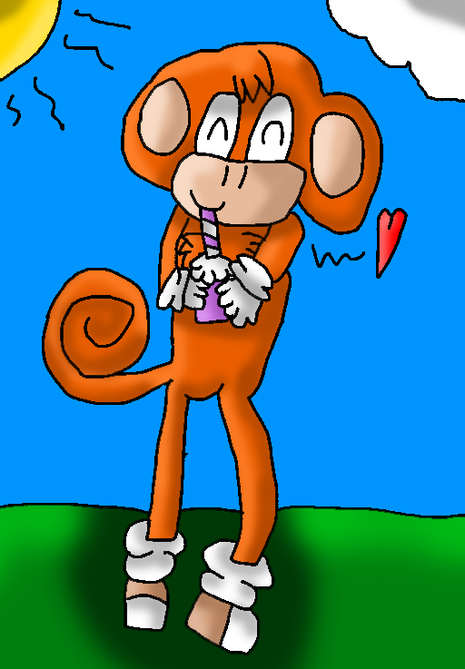
Milkshakes...
Milkshakes...
Milkshakes... by papiocutie

Description
Description
Ugh.This turned out awful....
His legs look awful XD
Be critical
No more "Cute""cool""He must like milkshakes"
No more of that crap please!
Alex@mine
His legs look awful XD
Be critical
No more "Cute""cool""He must like milkshakes"
No more of that crap please!
Alex@mine
General Info
General Info
Comments
5
Media Other drawing
Time Taken
Reference
Media Other drawing
Time Taken
Reference
Comments
You are not authorized to comment here. Your must be registered and logged in to comment
PicklePico on September 18, 2012, 3:07:06 PM
PicklePico on
papiocutie on September 18, 2012, 3:45:00 PM
papiocutie on
EpicSeaBreezeMaster on September 18, 2012, 11:27:56 AM
papiocutie on September 18, 2012, 11:34:41 AM
papiocutie on

I think you should have made the arms bent a bit if he wasn't sticking out his arms spilling the milkshake! Haha. For the legs, I see you probably were trying to make him "lean" on the bent one, but in this case both of the legs should have been straightened.
>> He is also tilting so you should have made the legs wider to balance out that body, or changed the lower half to meet the upper half or vice versa.
For the tail, you shouldn't make it look like he's turned around. The lines that make the body should be closed, showing that the tail is behind him, not sewed at his side.
For shading, yes, you may know where the shading goes but you can't carelessly shade everywhere (coughsaysthehypocritecough). That being said, there's "sharp" shading (I think it's called) and there's what you used here. It looks kind of "artificial."
Maybe next time make the lines you have for the sun the same color you made the sun?
As for backgrounds, I agree that maybe a milkshake stand or something along those lines would be good for the view to know what he was drinking if they didn't know it was a milkshake or you didn't title it "Milkshakes..." Overall it's neat, so keep practicing!