New Dreams and Nightmare
New Dreams and Nightmare
New Dreams and Nightmare by papiocutie
Description
Description

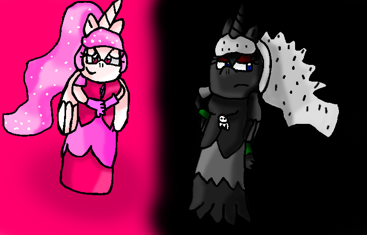
I changed them from MLP OCS to Sonic Ocs
Bio: The twin sisters were born out of the big bang along side thousands of other unicorns,They jobs were to create life in their own galaxy the milyway,They were created to have powers,Dreams was suppost to give dreams to everyone living thing in the galaxy until she rest out of dust,While she would refill the dream dust for the next night Nightmare would give nightmare to those who didn't give the dream dust.It was only to prevent people from dieing.The sister were immotral and could not die they can can get hurt though.
Nightmare,Dreams@mineee
BE CRITICAL
NOTES: WHO WANT ME TO UPLOAD THE SKETCH OF THIS!!!
General Info
General Info
Comments
12
Media Other drawing
Time Taken
Reference
Media Other drawing
Time Taken
Reference
Comments
You are not authorized to comment here. Your must be registered and logged in to comment
EpicSeaBreezeMaster on September 15, 2012, 10:42:19 AM
 Nightmares background should be lighter, I can't really find her arms. Only her writs and hands. I think the wings look weird on the side like that. Maybe they should be more on their backs. Also, they don't seem proptional, nightmare has a bigger body. Unless its supposed to be like that.
papiocutie on September 15, 2012, 10:45:18 AM
papiocutie on
Lol I noticed that when I was editing itIt looks pretty werid
They are both the same size since they are the same age XD
Thank for the comment though :D
EpicSeaBreezeMaster on September 15, 2012, 10:47:09 AM
Well I just mean you should focus on making it so they're proptional. But your welcomepapiocutie on September 15, 2012, 10:47:47 AM
papiocutie on
:Dstarhero3 on September 15, 2012, 5:56:59 AM
starhero3 on
 i think that they need crowns.
papiocutie on September 15, 2012, 6:04:05 AM
papiocutie on
I think you misunderstood,I want people to tell me what to fix,Not what to add,But crowns do seem like a good touch though they aren't princesses or queens XDstarhero3 on September 15, 2012, 6:32:34 AM
starhero3 on
oh yeah, now you tell me, that's ok.My-Melody on September 14, 2012, 6:02:05 PM
My-Melody on
 Your reason to block is quite foolish and not a good manner to show your professionalism as an Artist. It's like approaching to your Art teacher and asking him/her for a critique or else you'd hit them across their head. Perhaps you should re-edit your description about asking for critiques in a nicer manner instead of being rude and naive. If you want people to know that you want a critique, why not create a banner that states you want a critique in description? Or perhaps making the font in a bigger size so people can see it better. That way you won't feel so frustrated about people's ignorance about not reading a picture description.
Here's my critique:
The colors are vibrant, yet I feel that it distract too much from the focal point which is the characters. Perhaps the color of the background should be changed into a different color instead of making it similar to what the character is wearing. If you want to improve, I suggest learning how to draw backgrounds. Though it maybe challenging and quite "scary" because of all the errors and inability to draw new things, it doesn't hurt to experiment and learn. Be sure that the characters are postured straight instead of looking like they're slide down a steep hill. And you kind of misinterpreted the shading on the pink side. If you look at the bottom of the dress, the lighting is pointing the opposite direction in contrast to the other dress pieces from on top. Make sure to stick with where the lighting is located and know where to shade the areas even if it is basic like the one on the right side. Overall, you did a good job.
Falconlobo on September 14, 2012, 2:05:09 PM
Falconlobo on
 i think the right one would look better if the colors of the bg was a a bit purple and dark since the body does look similar to the color of the bg color
papiocutie on September 14, 2012, 2:05:51 PM
papiocutie on
You have a good point there,Thank youFalconlobo on September 14, 2012, 2:06:10 PM
Falconlobo on
you're welcome^^Falconlobo on September 14, 2012, 2:05:33 PM
Falconlobo on
sketch would be nice to see too