Kaito CSS animation
Kaito CSS animation
Kaito CSS animation by AzureMikari
Description
Description

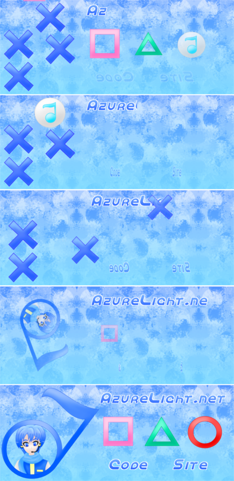
This isn't really a tutorial, it's more like a behind the scenes look at how I made the Vocaloid style animations on the banner on this layout AzureLightnet Kaito layout which you can see moving here http://azurelight.net In case you're viewing this in the future and I've changed the layout by then, you can see screen shots of different points on the animation. This is not Flash, hence why I can't post the moving file, it's all regular pngs moved by css.
All the images are in divs and the same images are reused sometimes, but all the divs have different ids. Sorry about the confusing numbers, I was experimenting and figuring things out as I went along, adding things, etc. Here is what each id belongs to.
#notex7 1st still x
#notex8 1st moving x
#notemusic4 musical note from 1st x
#notex5 2nd still x
#notex6 2nd moving x
#notemusic3 musical note from 2nd x
#notex1 3rd still x
#notex2 3rd moving x
#notemusic1 musical note from 3rd x
#notex3 4th still x
#notex4 4th moving x
#notemusic2 musical note from 4th x
The notes also have the class .notelook and the xs have .xlook
#notekaito the musical note with the Kaito fanart
#notemusic5 musical note from the square
#notemusic6 musical note from the triangle
#notemusic7 musical note from the circle
#notecircle1, #notetriangle1, #notesquare1 are still
#notecircle2, #notetriangle2, #notesquare2 are moving
Like I said, this isn't really a tutorial and there is an actual tutorial at http://azurelight.net but sometimes looking at code in use can help designers get a better idea of different ways to use it, so here's part of my code:
<style type="text/css" media="all">
*, body { font-family:Verdana; font-size:12px; -webkit-text-size-adjust:none;
cursor:url(design/fantasy4.cur),url(design/fantasy3.gif),crosshair; }
*:focus { outline:none; }
textarea { resize: none; }
span.bolet { font-weight:bold; }
span.itlet { font-style:italic; }
span.itabo { font-weight:bold; font-style:italic; }
table,td { border:0px none; border-collapse:collapse; vertical-align:middle;
border-spacing:0px; margin:0px auto 0px auto; padding:0px; text-align:center; }
div.left { padding:0px; margin:0px; border:0px none; text-align:left; background-color:transparent; }
button, input, textarea, select, option, a, span.textlink, #sendform, div#alnp:hover, div#codep:hover, div#sitep:hover {
cursor:url(design/fantasy2.cur),url(design/fantasy1.gif),help; }
div.part { padding:0px; margin:0px; border:0px none; text-align:center; background-color:transparent; }
img.pixgala { margin: 20px 10px 0px 10px; border:0px none; }
td.linky { padding:0px 20px 0px 20px; }
td.section { padding:14px 20px 0px 20px; }
ul.mylists { list-style-image:url(site/notelist.gif); margin:0px; line-height:30px; }
body { padding:0px; color:#303030;
background-color:#7be0ff; background-image:url(site/noteback.png);
background-attachment:scroll; background-repeat:repeat-x;
text-shadow:-1px 1px 0px #ffffff;
margin:0px; line-height:20px; letter-spacing:1px;
text-align:center; font-family:Verdana; font-size:12px; opacity:1.0;
animation-name: fadepage; animation-duration: 1s; animation-delay: 0s;
animation-timing-function: linear; animation-iteration-count: 1;
animation-direction: normal; animation-play-state: running; }
@keyframes fadepage { 0% { opacity:0.0; } 100% { opacity:1.0; } }
span.navpart { font-weight:bold; color:#ffffff;
border:3px dotted #ffffff; text-shadow:-1px 1px 0px #303030;
display:block; padding:7px; text-align:center;
background-image:url(site/noteback.png); background-repeat:repeat-x;
border-radius: 20px 20px 20px 20px / 20px 20px 20px 20px;
-moz-border-radius: 20px 20px 20px 20px / 20px 20px 20px 20px;
-webkit-border-radius: 20px 20px 20px 20px / 20px 20px 20px 20px; }
a, span.textlink, #sendform { color:#245eff; text-shadow:-1px 1px 0px #ffffff;
letter-spacing:1px; font-weight:bold; text-decoration:none; background-image:none;
border:0px none; background-color:transparent; padding:0px 10px 0px 10px; }
a:hover, span.textlink:hover, #sendform:hover { color:#4374ff;
background-image:url(site/notelink.gif); background-repeat:repeat-x;
text-shadow:1px 1px 0px #ffffff,-1px -1px 0px #ffffff,-1px 1px 0px #ffffff,1px -1px 0px #ffffff; }
.showbor { border:3px dotted #4374ff; background-color:#91bbff;
padding:0px; text-shadow:-1px 1px 0px #ffffff; color:#303030; }
input, textarea, select, option { letter-spacing:1px;
text-shadow:-1px 1px 0px #ffffff; color:#303030;
background-image:url(site/noteback2.png);
border-radius: 30px 30px 30px 30px / 30px 30px 30px 30px;
-moz-border-radius: 30px 30px 30px 30px / 30px 30px 30px 30px;
-webkit-border-radius: 30px 30px 30px 30px / 30px 30px 30px 30px; }
div#main { margin:0px; padding:0px; width:820px; text-align:center;
background-color:transparent; position:absolute; top:400px; left:200px; border:0px none; }
div#endnavi { margin:20px auto 10px auto; padding:10px 0px 0px 0px;
width:800px; text-align:center; background-color:transparent;
border-bottom:0px none; border-left:0px none; border-right:0px none; border-top:3px dotted #ffffff; }
div#alnp { border:0px none; margin:0px; padding:0px; background-color:transparent;
width:535px; height:64px; position:absolute; left:550px; top:25px; background-image:url(site/noteazure1.png); }
div#alnp:hover { background-image:url(site/noteazure2.png); }
div#codep { border:0px none; margin:0px; padding:0px; float:left; background-color:transparent;
width:171px; height:62px; position:absolute; left:590px; top:300px; background-image:url(site/notecode1.png);
transform: rotateY(0deg); -webkit-transform: rotateY(0deg); -moz-transform: rotateY(0deg); opacity:1.0; }
div#codep:hover { background-image:url(site/notecode2.png); }
div#sitep { border:0px none; margin:0px; padding:0px; float:left; background-color:transparent;
width:159px; height:61px; position:relative; left:850px; top:300px; background-image:url(site/notesite1.png);
transform: rotateY(0deg); -webkit-transform: rotateY(0deg); -moz-transform: rotateY(0deg); opacity:1.0; }
div#sitep:hover { background-image:url(site/notesite2.png); }
a.navilink { background-image:none; }
div#alnp, div#codep, div#sitep, #notekaito, .notelook, .xlook, .morenote {
animation-delay: 0s;
animation-timing-function: linear;
animation-iteration-count: 1;
animation-direction: normal;
animation-play-state: running;
animation-duration: 10s; }
div#alnp { animation-name: vocaloid1; }
@keyframes vocaloid1 {
0% { width:0px; height:64px; }
62% { width:535px; height:64px; }
100% { width:535px; height:64px; } }
div#codep, div#sitep { animation-name: vocaloid2; }
@keyframes vocaloid2 {
0% { transform: rotateY(0deg); -webkit-transform: rotateY(0deg); -moz-transform: rotateY(0deg); opacity:0.0; }
62% { transform: rotateY(1080deg); -webkit-transform: rotateY(1080deg); -moz-transform: rotateY(1080deg); opacity:1.0; }
100% { transform: rotateY(1080deg); -webkit-transform: rotateY(1080deg); -moz-transform: rotateY(1080deg); opacity:1.0; } }
.notelook { background-image:url(site/notemusic.png); border:0px none; margin:0px; padding:0px;
background-repeat:no-repeat; background-position:center center; width:138px; height:134px; }
.xlook { background-image:url(site/notex.png); border:0px none; margin:0px; padding:0px;
background-repeat:no-repeat; background-position:center center; width:138px; height:134px; }
#notemusic2 { position:absolute; left:210px; top:263px; opacity:0.0; background-size: 0% 0%; animation-name: vocaloid11; }
#notex3 { position:absolute; left:210px; top:263px; opacity:0.0; background-size: 0% 0%; animation-name: vocaloid10; }
#notex4 { position:absolute; left:210px; top:263px; opacity:0.0; background-size: 0% 0%; animation-name: vocaloid9; }
@keyframes vocaloid9 {
0% { top:-150px; left:910px; }
33% { top:-150px; left:910px; }
37% { top:335px; }
40% { left:210px; top:263px; opacity:1.0; background-size: 100% 100%; }
45% { left:210px; top:263px; opacity:0.0; background-size: 0% 0%; }
100% { left:210px; top:263px; opacity:0.0; background-size: 0% 0%; } }
@keyframes vocaloid10 {
0% { opacity:1.0; background-size: 100% 100%; }
40% { opacity:1.0; background-size: 100% 100%; }
45% { opacity:0.0; background-size: 0% 0%; }
100% { opacity:0.0; background-size: 0% 0%; } }
@keyframes vocaloid11 {
0% { opacity:0.0; background-size: 0% 0%; }
40% { opacity:0.0; background-size: 0% 0%; }
45% { opacity:1.0; background-size: 100% 100%; }
50% { opacity:0.0; background-size: 0% 0%; }
100% { opacity:0.0; background-size: 0% 0%; } }
#notemusic1 { position:absolute; left:210px; top:130px; opacity:0.0; background-size: 0% 0%; animation-name: vocaloid14; }
#notex1 { position:absolute; left:210px; top:130px; opacity:0.0; background-size: 0% 0%; animation-name: vocaloid13; }
#notex2 { position:absolute; left:210px; top:130px; opacity:0.0; background-size: 0% 0%; animation-name: vocaloid12; }
@keyframes vocaloid12 {
0% { top:-150px; left:890px; }
25% { top:-150px; left:890px; }
30% { top:-150px; left:890px; }
34% { top:200px; }
37% { left:210px; top:130px; opacity:1.0; background-size: 100% 100%; }
42% { left:210px; top:130px; opacity:0.0; background-size: 0% 0%; }
100% { left:210px; top:130px; opacity:0.0; background-size: 0% 0%; } }
@keyframes vocaloid13 {
0% { opacity:1.0; background-size: 100% 100%; }
37% { opacity:1.0; background-size: 100% 100%; }
42% { opacity:0.0; background-size: 0% 0%; }
100% { opacity:0.0; background-size: 0% 0%; } }
@keyframes vocaloid14 {
0% { opacity:0.0; background-size: 0% 0%; }
37% { opacity:0.0; background-size: 0% 0%; }
42% { opacity:1.0; background-size: 100% 100%; }
47% { opacity:0.0; background-size: 0% 0%; }
100% { opacity:0.0; background-size: 0% 0%; } }
#notemusic3 { position:absolute; left:380px; top:150px; opacity:0.0; background-size: 0% 0%; animation-name: vocaloid8; }
#notex5 { position:absolute; left:380px; top:150px; opacity:0.0; background-size: 0% 0%; animation-name: vocaloid7; }
#notex6 { position:absolute; left:380px; top:150px; opacity:0.0; background-size: 0% 0%; animation-name: vocaloid6; }
@keyframes vocaloid6 {
0% { top:-150px; left:640px; }
20% { top:-150px; left:640px; }
25% { left:380px; top:150px; opacity:1.0; background-size: 100% 100%; }
30% { left:380px; top:150px; opacity:0.0; background-size: 0% 0%; }
100% { left:380px; top:150px; opacity:0.0; background-size: 0% 0%; } }
@keyframes vocaloid7 {
0% { opacity:1.0; background-size: 100% 100%; }
25% { opacity:1.0; background-size: 100% 100%; }
30% { opacity:0.0; background-size: 0% 0%; }
100% { opacity:0.0; background-size: 0% 0%; } }
@keyframes vocaloid8 {
0% { opacity:0.0; background-size: 0% 0%; }
25% { opacity:0.0; background-size: 0% 0%; }
30% { opacity:1.0; background-size: 100% 100%; }
35% { opacity:0.0; background-size: 0% 0%; }
100% { opacity:0.0; background-size: 0% 0%; } }
#notemusic4 { position:absolute; left:340px; top:20px; animation-name: vocaloid5; opacity:0.0; background-size: 0% 0%; }
#notex7 { position:absolute; left:340px; top:20px; animation-name: vocaloid4; opacity:0.0; background-size: 0% 0%; }
#notex8 { position:absolute; left:340px; top:20px; animation-name: vocaloid3; opacity:0.0; background-size: 0% 0%; }
@keyframes vocaloid3 {
0% { top:-150px; left:540px; }
15% { top:-150px; left:540px; }
20% { top:20px; left:340px; opacity:1.0; background-size: 100% 100%; }
25% { top:20px; left:340px; opacity:0.0; background-size: 0% 0%; }
100% { top:20px; left:340px; opacity:0.0; background-size: 0% 0%; } }
@keyframes vocaloid4 {
0% { opacity:1.0; background-size: 100% 100%; }
20% { opacity:1.0; background-size: 100% 100%; }
25% { opacity:0.0; background-size: 0% 0%; }
100% { opacity:0.0; background-size: 0% 0%; } }
@keyframes vocaloid5 {
0% { opacity:0.0; background-size: 0% 0%; }
20% { opacity:0.0; background-size: 0% 0%; }
25% { opacity:1.0; background-size: 100% 100%; }
30% { opacity:0.0; background-size: 0% 0%; }
100% { opacity:0.0; background-size: 0% 0%; } }
#notekaito { position:absolute; left:150px; top:10px; width:415px; height:385px; border:0px none;
margin:0px; padding:0px; background-repeat:no-repeat; background-position:center center;
background-image:url(site/notekaito.png); animation-name: vocaloid15; opacity:1.0; background-size: 100% 100%; }
@keyframes vocaloid15 {
0% { opacity:0.0; background-size: 0% 0%; }
50% { opacity:0.0; background-size: 0% 0%;
transform: rotate(0deg); -moz-transform: rotate(0deg); -webkit-transform: rotate(0deg); }
60% { opacity:1.0; background-size: 100% 100%;
transform: rotate(720deg); -moz-transform: rotate(720deg); -webkit-transform: rotate(720deg); }
100% { opacity:1.0; background-size: 100% 100%;
transform: rotate(720deg); -moz-transform: rotate(720deg); -webkit-transform: rotate(720deg); } }
.morenote { border:0px none; margin:0px; padding:0px; background-repeat:no-repeat; background-position:center center; }
#notemusic5 { position:absolute; left:565px; top:125px; width:138px; height:137px;
animation-name: vocaloid24; opacity:0.0; background-size: 0% 0%; }
#notesquare1 { position:absolute; left:565px; top:125px; width:138px; height:137px;
background-image:url(site/notesquare.png); animation-name: vocaloid23; opacity:1.0; background-size: 100% 100%; }
#notesquare2 { position:absolute; left:565px; top:125px; width:138px; height:137px;
background-image:url(site/notesquare.png); animation-name: vocaloid22; opacity:0.0; background-size: 0% 0%; }
@keyframes vocaloid22 {
0% { top:-150px; left:200px; }
10% { top:-150px; left:200px; }
15% { left:565px; top:125px; opacity:1.0; background-size: 100% 100%; }
20% { left:565px; top:125px; opacity:0.0; background-size: 0% 0%; }
100% { left:565px; top:125px; opacity:0.0; background-size: 0% 0%; } }
@keyframes vocaloid23 {
0% { opacity:1.0; background-size: 100% 100%; }
15% { opacity:1.0; background-size: 100% 100%; }
20% { opacity:0.0; background-size: 0% 0%; }
55% { opacity:0.0; background-size: 0% 0%; }
58% { opacity:1.0; background-size: 100% 100%; }
100% { opacity:1.0; background-size: 100% 100%; } }
@keyframes vocaloid24 {
0% { opacity:0.0; background-size: 0% 0%; }
15% { opacity:0.0; background-size: 0% 0%; }
20% { opacity:1.0; background-size: 100% 100%; }
25% { opacity:0.0; background-size: 0% 0%; }
100% { opacity:0.0; background-size: 0% 0%; } }
#notemusic6 { position:absolute; left:735px; top:125px; width:160px; height:140px;
animation-name: vocaloid21; opacity:0.0; background-size: 0% 0%; }
#notetriangle1 { position:absolute; left:735px; top:125px; width:160px; height:140px;
background-image:url(site/notetriangle.png); animation-name: vocaloid20; opacity:1.0; background-size: 100% 100%; }
#notetriangle2 { position:absolute; left:735px; top:125px; width:160px; height:140px;
background-image:url(site/notetriangle.png); animation-name: vocaloid19; opacity:0.0; background-size: 0% 0%; }
@keyframes vocaloid19 {
0% { top:-150px; left:500px; }
5% { top:-150px; left:500px; }
10% { left:735px; top:125px; opacity:1.0; background-size: 100% 100%; }
15% { left:735px; top:125px; opacity:0.0; background-size: 0% 0%; }
100% { left:735px; top:125px; opacity:0.0; background-size: 0% 0%; } }
@keyframes vocaloid20 {
0% { opacity:1.0; background-size: 100% 100%; }
10% { opacity:1.0; background-size: 100% 100%; }
15% { opacity:0.0; background-size: 0% 0%; }
57% { opacity:0.0; background-size: 0% 0%; }
60% { opacity:1.0; background-size: 100% 100%; }
100% { opacity:1.0; background-size: 100% 100%; } }
@keyframes vocaloid21 {
0% { opacity:0.0; background-size: 0% 0%; }
10% { opacity:0.0; background-size: 0% 0%; }
15% { opacity:1.0; background-size: 100% 100%; }
20% { opacity:0.0; background-size: 0% 0%; }
100% { opacity:0.0; background-size: 0% 0%; } }
#notemusic7 { position:absolute; left:910px; top:125px; width:158px; height:147px;
animation-name: vocaloid18; opacity:0.0; background-size: 0% 0%; }
#notecircle1 { position:absolute; left:910px; top:125px; width:158px; height:147px;
background-image:url(site/notecircle.png); animation-name: vocaloid17; opacity:1.0; background-size: 100% 100%; }
#notecircle2 { position:absolute; left:910px; top:125px; width:158px; height:147px;
background-image:url(site/notecircle.png); animation-name: vocaloid16; opacity:0.0; background-size: 0% 0%; }
@keyframes vocaloid16 {
0% { top:-150px; left:800px; }
5% { left:910px; top:125px; opacity:1.0; background-size: 100% 100%; }
10% { left:910px; top:125px; opacity:0.0; background-size: 0% 0%; }
100% { left:910px; top:125px; opacity:0.0; background-size: 0% 0%; } }
@keyframes vocaloid17 {
0% { opacity:1.0; background-size: 100% 100%; }
5% { opacity:1.0; background-size: 100% 100%; }
10% { opacity:0.0; background-size: 0% 0%; }
59% { opacity:0.0; background-size: 0% 0%; }
62% { opacity:1.0; background-size: 100% 100%; }
100% { opacity:1.0; background-size: 100% 100%; } }
@keyframes vocaloid18 {
0% { opacity:0.0; background-size: 0% 0%; }
5% { opacity:0.0; background-size: 0% 0%; }
10% { opacity:1.0; background-size: 100% 100%; }
15% { opacity:0.0; background-size: 0% 0%; }
100% { opacity:0.0; background-size: 0% 0%; } }
</style> </head> <body>
<a class="navilink" href="index.php"><div id="alnp"></div></a>
<a class="navilink" href="code0.php"><div id="codep"></div></a>
<a class="navilink" href="about.php"><div id="sitep"></div></a>
<div id="notekaito"></div>
<div id="notemusic1" class="notelook"></div>
<div id="notemusic2" class="notelook"></div>
<div id="notemusic3" class="notelook"></div>
<div id="notemusic4" class="notelook"></div>
<div id="notex1" class="xlook"></div>
<div id="notex2" class="xlook"></div>
<div id="notex3" class="xlook"></div>
<div id="notex4" class="xlook"></div>
<div id="notex5" class="xlook"></div>
<div id="notex6" class="xlook"></div>
<div id="notex7" class="xlook"></div>
<div id="notex8" class="xlook"></div>
<div id="notemusic5" class="notelook"></div>
<div id="notemusic6" class="notelook"></div>
<div id="notemusic7" class="notelook"></div>
<div id="notesquare1" class="morenote"></div>
<div id="notetriangle1" class="morenote"></div>
<div id="notecircle1" class="morenote"></div>
<div id="notesquare2" class="morenote"></div>
<div id="notetriangle2" class="morenote"></div>
<div id="notecircle2" class="morenote"></div>
<div id="main">
</div> </body> </html>
General Info
General Info
Comments
0
Media Digital drawing or painting
Time Taken
Reference
Media Digital drawing or painting
Time Taken
Reference
Comments
You are not authorized to comment here. Your must be registered and logged in to comment