Sailor Moon css animation
Sailor Moon css animation
Sailor Moon css animation by AzureMikari
Description
Description

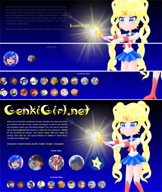
For the same reasons explained here http://www.fanart-central.net/pictures/user/AzureMikari/844987/Kaito-CSS-animation I decided to post this coding example here. Again, it's not a tutorial, more like a behind the scenes example for the layout of http://genkigirl.net You can see it there or see some screens shots above if you're looking at this later after the layout has changed. The actual tutorials are here http://azurelight.net
<style type="text/css" media="all">
*, html, body { cursor:url(genki/arrowcur.cur),url(genki/arrowgif.gif),crosshair; -webkit-text-size-adjust: none; }
*:focus { outline:none; }
img, div, table, td { border:0px none; }
table, td { text-align:center; }
td.link1 { width:70px; height:70px; }
td.link2 { width:130px; height:130px; }
div.section { font-weight:bold; text-align:center;
animation-delay: 0s;
animation-timing-function: linear;
animation-iteration-count: 1;
animation-direction: normal;
animation-play-state: running; }
div.mylinks1 { width:50px; height:50px; background-size:50px 50px; animation-name: myani1; position:relative; left:0px; }
div.mylinks3 { width:50px; height:50px; background-size:50px 50px; animation-name: myani11; position:relative; left:0px; }
div.mylinks2 { width:100px; height:100px; background-size:100px 100px; }
div.mylinks1:hover, div.mylinks2:hover, div.mylinks3:hover { cursor:url(genki/arrowcur2.cur),url(genki/arrowgif2.gif),crosshair; }
div#intro, img#genki { animation-duration: 3s; }
div.mylinks2, #acsites { animation-duration: 5s; }
div.mylinks1, #arcsite { animation-duration: 7s; }
div.mylinks3, #teams { animation-duration: 9s; }
#linking { animation-duration: 11s; }
div.mylinks1, div.mylinks2, div.mylinks3 {
border-radius: 70px 70px 70px 70px / 70px 70px 70px 70px;
-moz-border-radius: 70px 70px 70px 70px / 70px 70px 70px 70px;
-webkit-border-radius: 70px 70px 70px 70px / 70px 70px 70px 70px;
background-position:center center; padding:0px; margin:0px auto 0px auto;
animation-delay: 0s;
animation-timing-function: linear;
animation-iteration-count: 1;
animation-direction: normal;
animation-play-state: running; }
@keyframes myani11 {
0% { width:0px; height:0px; background-size:0px 0px; position:relative; left:-1000px; }
70% { width:0px; height:0px; background-size:0px 0px; position:relative; left:-1000px; }
77% { width:50px; height:50px; background-size:50px 50px; }
100% {position:relative; left:0px; transform:rotate(1440deg); -moz-transform:rotate(1440deg); -webkit-transform:rotate(1440deg); } }
#linking { animation-name: myani13; }
@keyframes myani13 {
0% { opacity:0.0; }
90% { opacity:0.0; }
100% { opacity:1.0; } }
#teams { animation-name: myani12; }
@keyframes myani12 {
0% { opacity:0.0; }
70% { opacity:0.0; }
100% { opacity:1.0; } }
#arcsite { animation-name: myani10; }
@keyframes myani10 {
0% { opacity:0.0; }
60% { opacity:0.0; }
100% { opacity:1.0; } }
@keyframes myani1 {
0% { width:0px; height:0px; background-size:0px 0px; position:relative; left:-1000px; }
65% { width:0px; height:0px; background-size:0px 0px; position:relative; left:-1000px; }
70% { width:50px; height:50px; background-size:50px 50px; }
100% {position:relative; left:0px; transform:rotate(1440deg); -moz-transform:rotate(1440deg); -webkit-transform:rotate(1440deg); } }
#active1 { animation-name: myani2; }
#active2 { animation-name: myani3; }
#active3 { animation-name: myani4; }
#active4 { animation-name: myani5; }
#active5 { animation-name: myani6; }
@keyframes myani2 {
0% { width:0px; height:0px; background-size:0px 0px; }
52% { width:0px; height:0px; background-size:0px 0px;
transform:rotate(200deg); -moz-transform:rotate(200deg); -webkit-transform:rotate(200deg); }
60% { width:100px; height:100px; background-size:100px 100px;
transform:rotate(720deg); -moz-transform:rotate(720deg); -webkit-transform:rotate(720deg); }
100% { transform:rotate(720deg); -moz-transform:rotate(720deg); -webkit-transform:rotate(720deg); } }
@keyframes myani3 {
0% { width:0px; height:0px; background-size:0px 0px; }
62% { width:0px; height:0px; background-size:0px 0px;
transform:rotate(200deg); -moz-transform:rotate(200deg); -webkit-transform:rotate(200deg); }
70% { width:100px; height:100px; background-size:100px 100px;
transform:rotate(720deg); -moz-transform:rotate(720deg); -webkit-transform:rotate(720deg); }
100% { transform:rotate(720deg); -moz-transform:rotate(720deg); -webkit-transform:rotate(720deg); } }
@keyframes myani4 {
0% { width:0px; height:0px; background-size:0px 0px; }
72% { width:0px; height:0px; background-size:0px 0px;
transform:rotate(200deg); -moz-transform:rotate(200deg); -webkit-transform:rotate(200deg); }
80% { width:100px; height:100px; background-size:100px 100px;
transform:rotate(720deg); -moz-transform:rotate(720deg); -webkit-transform:rotate(720deg); }
100% { transform:rotate(720deg); -moz-transform:rotate(720deg); -webkit-transform:rotate(720deg); } }
@keyframes myani5 {
0% { width:0px; height:0px; background-size:0px 0px; }
82% { width:0px; height:0px; background-size:0px 0px;
transform:rotate(200deg); -moz-transform:rotate(200deg); -webkit-transform:rotate(200deg); }
90% { width:100px; height:100px; background-size:100px 100px;
transform:rotate(720deg); -moz-transform:rotate(720deg); -webkit-transform:rotate(720deg); }
100% { transform:rotate(720deg); -moz-transform:rotate(720deg); -webkit-transform:rotate(720deg); } }
@keyframes myani6 {
0% { width:0px; height:0px; background-size:0px 0px; }
92% { width:0px; height:0px; background-size:0px 0px;
transform:rotate(200deg); -moz-transform:rotate(200deg); -webkit-transform:rotate(200deg); }
100% { width:100px; height:100px; background-size:100px 100px;
transform:rotate(720deg); -moz-transform:rotate(720deg); -webkit-transform:rotate(720deg); } }
#acsites { animation-name: myani9; }
@keyframes myani9 {
0% { opacity:0.0; }
50% { opacity:0.0; }
100% { opacity:1.0; } }
img#moon { position:absolute; top:0px; right:100px; z-index:1; }
div#intro { text-align:justify; margin:0px; position:absolute; top:132px; right:650px;
padding:0px; background-color:transparent; z-index:7; width:390px;
animation-name: myani7;
animation-delay: 0s;
animation-timing-function: linear;
animation-iteration-count: 1;
animation-direction: normal;
animation-play-state: running; }
@keyframes myani7 {
0% { opacity:0.0; position:absolute; top:0px; right:650px; }
50% { opacity:0.5; position:absolute; top:132px; right:650px; }
70% { opacity:1.0; position:absolute; top:132px; right:650px; }
100% { opacity:1.0; position:absolute; top:132px; right:650px; } }
img#genki { z-index:2; max-width:563px;
position:absolute; top:25px; right:500px;
animation-name: myani8;
animation-delay: 0s;
animation-timing-function: linear;
animation-iteration-count: 1;
animation-direction: normal;
animation-play-state: running; }
@keyframes myani8 {
0% { opacity:0.0; top:240px; right:440px; max-width:0px; }
10% { top:240px; right:440px; max-width:50px; }
30% { opacity:1.0; }
80% { top:25px; right:500px; max-width:563px; }
90% { opacity:1.0; }
95% { opacity:0.0; }
100% { opacity:1.0; } }
body { text-align:left; margin:0px; padding:0px; font-size:12px;
font-family:Arial; background-color:#0900ff; color:#ffffff; line-height:18px;
background-image:url(genki/blueback.png); background-attachment:fixed; background-repeat:repeat-x; }
a { font-weight:bold; text-decoration:none; color:#f8ff73; text-shadow: -1px 1px 0px #000000;
cursor:url(genki/arrowcur2.cur),url(genki/arrowgif2.gif),crosshair; font-style:italic; }
a:hover { color:#ffe900; }
div#sites { text-align:justify; z-index:7; width:655px; background-color:transparent;
margin:0px; padding:0px; position:absolute; top:320px; right:395px; }
div.cent { text-align:center; margin:0px auto 0px auto; padding:0px; }
span.bolet { font-weight:bold; }
<?php $links = $_GET["links"];
switch ($links) {
case "show": echo "* { animation-duration: 1s !important; }"; break;
case "hide": echo "* { animation-duration: 1s !important; }"; break;
default: echo ""; break; } ?>
</style>
General Info
General Info
Ratings
Category Anime/Manga » Sailor Moon series » Sailor Scouts » Sailor Moon (Serena)
Date Submitted
Views 680
Favorites... 0
Vote Score 0
Category Anime/Manga » Sailor Moon series » Sailor Scouts » Sailor Moon (Serena)
Date Submitted
Views 680
Favorites... 0
Vote Score 0
Comments
0
Media Digital drawing or painting
Time Taken
Reference
Media Digital drawing or painting
Time Taken
Reference
Comments
You are not authorized to comment here. Your must be registered and logged in to comment