Umi
Umi
Umi by BAMFManiac
Description
Description

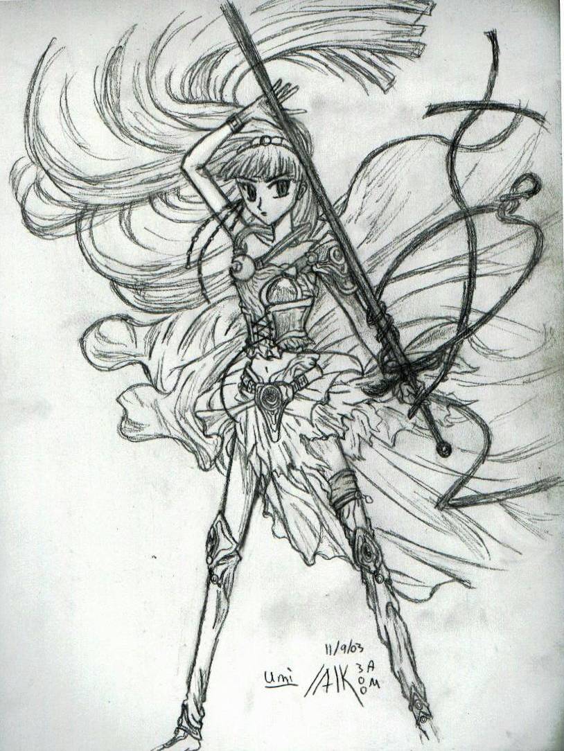
this is from the cover of the 2nd book in the 1st manga series. i kind of bs'd the hair and skirt thing because it was waaaay too detailed. but it came out ok i guess. her legs are too thin and the hair on the far left doesn't curve rite. o well... Please Comment!
General Info
General Info
Ratings
Category Anime/Manga » Magic Knight Rayearth » Umi
Date Submitted
Views 2029
Favorites... 4
Vote Score 0
Category Anime/Manga » Magic Knight Rayearth » Umi
Date Submitted
Views 2029
Favorites... 4
Vote Score 0
Comments
8
Media Unspecified
Time Taken
Reference
Media Unspecified
Time Taken
Reference
Comments
You are not authorized to comment here. Your must be registered and logged in to comment
Lilith_SpiritOfTheNight on February 2, 2005, 10:35:39 AM
 I really love the pose and everything! Very cool pic. *favs*
DeathBo on April 11, 2004, 5:36:08 PM
DeathBo on
BAMFManiac on March 16, 2004, 9:30:02 AM
BAMFManiac on
thanks!<br /><br />
mm yea their was an intricate border framing her in the original pic, which i didn't try drawing. so that's why her hair just fades away into nothing. i'm also not used to really defining edges to my pics, so i didn't really think about it for this one. but yea it would look better.
Jyan on March 8, 2004, 11:52:41 AM
Jyan on
Actually I love the skirt most of all. I don't get to see much TV so I don't really know what she is supposed to look like, but I think the skirt and hair have plenty of detail in them. What could have helped the hair a little more though is if you defined the ends (on the top right). Leaving the negative space in the length of the hair is fine, that just indicates that the hair is being shinny, but if you leave the negative space at the end of the hair it makes it look like there just isn't hair there. Most of the time you have to define at least the boundaries of pics. The only exception I can think of right now is if you have color or a background to help show the contrast to imply to the viewer where the boundaries are. I am sure there are more exceptions as well. In order to define the boundaries, if you want to keep it light, you just need a line here and there, nothing heavy. It doesn't even have to connect to anything. I realize it will be hard - it is hair, it is SUPPOSED to be hard - but it should help if you get it correctly.<br />
<br />
Drawing something different from the original isn't bad, actually I think it is good =) There are a million and one different ways to draw the same thing and who is to say that one way is correct?
Juli on February 15, 2004, 8:25:18 AM
Juli on
 Very nice! There's nothing wrong with changing the hair, skirt, whatnot because its more original! Nice!
BAMFManiac on February 7, 2004, 12:36:42 PM
BAMFManiac on
thank you both very much!! Burning_Ice on February 3, 2004, 5:28:34 AM
Burning_Ice on
<br />
-Icy
midnightoasis on February 2, 2004, 12:21:41 PM
 hey, did you repost this? ^_^<br />
<br />
anyways, i love this pic! the flowing lines and "sketchy" style suit the knight of water very well =D