Britney Spears 2
Britney Spears 2
Britney Spears 2 by BekkiVV
Description
Description
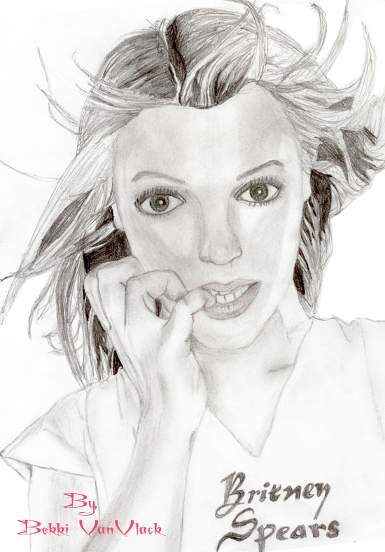
this ones OK i guess, not too bad
General Info
General Info
Ratings
Category Real People » Singers & Bands » Solo Artist » Britney Spears
Date Submitted
Views 1910
Favorites... 1
Vote Score 0
Category Real People » Singers & Bands » Solo Artist » Britney Spears
Date Submitted
Views 1910
Favorites... 1
Vote Score 0
Comments
5
Media Unspecified
Time Taken
Reference
Media Unspecified
Time Taken
Reference
Comments
You are not authorized to comment here. Your must be registered and logged in to comment
Maestro on November 16, 2005, 11:21:54 AM
Maestro on
Maestro on November 16, 2005, 11:19:40 AM
Maestro on
 Hi, your fiance suggested that I should comment on your work... Well, this pic is quite good - I'd know it's Britney even without the title. You did a fabulous job on the hand! The spread and curvature of the fingers is very real!! The hair is very good too - you captured the motion of the air, nice!!!
My two cents: depending on which side you're casting light from, you could perhaps try to shade the opposite side of the face alittle darker on the outer edge, as the rounding of the face is curving away from the light... This is my basic take on contrast (as your fiance already knows, and as you can probably tell from my art also...), but greater contrast really adds that 3D feel and allows your drawings to really lift up off the paper... (or is it "screen"?) Oh, and one little tip on the eyes: when doing eyelashes, make them blend or rather fade out (thin out) towards their end (you know, relieving pressure on the pencil as you get to the end of the line... this goes for any hair, I guess) But, basically, that makes the anatomy of the eye sit naturally on the rest of the face and gets rid of that slightly "cut'n'pasted" look that we get when we make the eyelashes too stubby/abrupt.
peter89 on November 12, 2005, 10:11:06 AM
peter89 on
Squirrel_person on October 27, 2005, 6:51:37 AM
moonandstars on October 18, 2005, 7:23:32 AM
moonandstars on
But to be honest, I myself always sucked at portraits, so don't take me too seriously...
Generally, if you make your lights and darks get into a little more conflict among your drawings (umm... contrast!), then they will elevate your art off the canvas and immerse it into a wealth of three-dimensional emotion... (there I go, sounding like a poet again, dang it...)
You are already a great artist, but with a wee-bit of further practice, I think you will realize your potential as a master!!!
And sorry for rumbling on for so long, I'll shut up now... **violently stuffs an old sock in his mouth, then crawls into his closet and hides...**