M. Shadows
M. Shadows
M. Shadows by Epiphany347
Description
Description

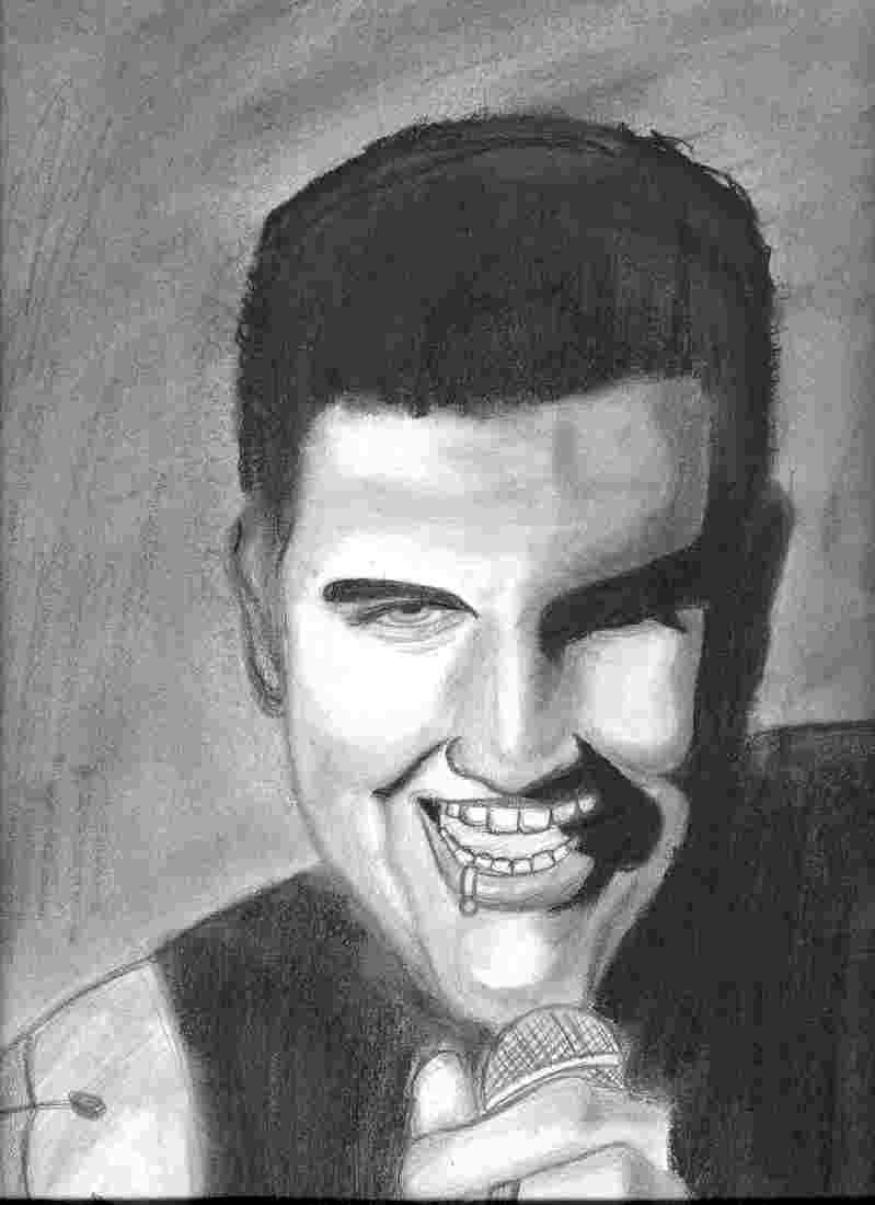
Well Here's M. Shadows for you. I think it's safe to say that there's definatly a lot of room to improve. Wasn't really that pleased with the final result. His right ear looks terrible and i could've done a little better on the eye and his hair but I think I did well on the shading. I don't I really improved that much, this looks like it would be on the same level as my Corey Taylor drawing so I'm going to keep practicing. If you have any suggestions for me please tell me.
General Info
General Info
Ratings
Category Real People » Singers & Bands » Group/Band » Avenged Sevenfold
Date Submitted
Views 1738
Favorites... 1
Vote Score 2
Category Real People » Singers & Bands » Group/Band » Avenged Sevenfold
Date Submitted
Views 1738
Favorites... 1
Vote Score 2
Comments
8
Media Charcoal
Time Taken A few days
Reference Photo from Bat Country video
Media Charcoal
Time Taken A few days
Reference Photo from Bat Country video
Comments
You are not authorized to comment here. Your must be registered and logged in to comment
marschiboi on March 29, 2007, 10:43:19 PM
marschiboi on
AriaGunnir on January 20, 2007, 12:38:47 AM
AriaGunnir on
 This slanting that was mentioned could also be because you are working on a flat surface: so that when you draw it from one angle, it distorts your perspective slightly. May I suggest drawing on an easel, or a table raised at one side, or even if you could temporarily tape (masking tape or painter's tape is the least destructive to surfaces) it to a wall. If you are looking at it straight on it would probably eliminate most of your "angle" issues. 8)
Also, this looks really well done, but may I suggest that when you are shading, try to get a little more mid-tone shades around the edges of the large blocks/areas of dark tone... May I also suggest, if you haven't done this already, that you get different pencils with a range of hard led (for lighter tones) and soft led (for darker tones). They aren't too expensive and if you know an art teacher or friend they could let you experiment with them a little. Here is a helpful link to illustrate what I mean:
http://drawsketch.about.com/od/graphitepencilfaq/f/Pencil_hbgrades.htm
http://www.sitecircle.net/wp-content/uploads/2006/06/pencildemo.jpg
http://www.artistsupplies.com/Fine%20Art%20Supplies/Art%20Pencils/Draw%20Sketch%20Pencils/IND_Draw_Pencils.htm
Yume83 on October 3, 2006, 5:41:20 PM
Yume83 on
 Okay, I think the look on the guys face is really cool and very exciting. The only thing is a lot of things are online:teeth, lip ring, mike. Unlike in the anime world or animiation things are not outline. A lot of the time we want to online them however, we have to tell ourselves "no." I know it is hard since I use to do the samething with real drawings of people. Plus, I not sure about his shoulder on the left.It appers a bit rush and not quite right. I am so sorry if I make you upset but I know that my drawings are not the best either. I hope I helped a little. Keep on drawing! XD
ArtistinTraining56 on July 6, 2006, 2:41:00 PM
 Ok I'm going to tell you exactly what I think.(don't take it personally)positives: I think you did a great job with the facial tones it really made the image all the more real. Also the darkest shadows on the right side are done very well also. Your probably thinking " oh no sweat it's all just plain black" but you kept the same tone of black through all of it without giving it that weird wavy look. Which can be difficult to do because of the pencil strokes running over the same lines over and over again. Also It's good that you spent extra time in putting all the little extra hairs that stick out. Little details like this can make a difference. I'm just glad you didn't ignore them. I mean if it's in the picture, draw it. Negatives: ok, the brutal part. I think you really should have spent more time on The eye and eyebrow. In comparison with everything else it's giving it a cartoonish look. With the eyebrow I think you should have put each individual hair on it rather than a long solid black shape. With his eye all that was needed was more attention to detail in the cornia area. This would all really help to make the picture look more realistic. Next, is his teeth shouldn't have been outlined. For teeth all you really have to do is shade around them, and if the photo had some shine on the teeth you can do that too. Same with the lip ring. Lastly the microphone. This looks the most rushed. All that it looks like you did was crap out a diagonal pattern and that's it. No offense, but if your gonna spend the time to do all that great tonal work and shade everything, then why rush on everything else? It really ruins the drawing when you rush. Anyways all together I'd probably give this pic a 7.0 out of 10. Once again don't take this review wrong, I'm usually not this brutal. But I'm still not gonna lie to you. Anyways this review is meant to be helpful not negative. Also think about it, I'm not the most experienced person on this either. I'm just trying to give the best advice that I can. Hope I could be helpful.
Jim
Epiphany347 on August 31, 2006, 3:45:52 AM
Epiphany347 on
Thanks for you're advice, I'll take everything you said into account. I'm just surprised you didn't say anything about the ear. Out of everything else that was the one thing I really did a "crap" job on.xiaocaca on August 31, 2006, 12:07:04 AM
xiaocaca on
Comment Deleted
Epiphany347 on August 31, 2006, 3:41:43 AM
Epiphany347 on
Yeah I see what you mean, with the eye and all.SynisterxGirl on July 16, 2006, 6:13:28 AM
 That rocks! I Like the way you have brought out the true colours of dear M Shadows....Keep it up ! *adds to faves*
my advice for you: dont make the lines of the teeth so dark - that leads to a rather cartoonish impression. to make it even more realistic try to keep the shadow thing err (you know?) i mean style (i guess) through the pic, that is especially the eyes and mouth
theres nothing much to say apart from that, you did shadow his face really good and the hair looks real (though its pretty much only black but still) uh yeah good work! :)