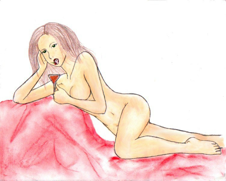
jackueline w/cosmopolitan
jackueline w/cosmopolitan
jackueline w/cosmopolitan by PunchenAngel666

Description
Description
General Info
General Info
Ratings
Category Miscellaneous » Characters » Female
Date Submitted
Views 1713
Favorites... 2
Vote Score 0
Category Miscellaneous » Characters » Female
Date Submitted
Views 1713
Favorites... 2
Vote Score 0
Comments
7
Media Unspecified
Time Taken
Reference
Media Unspecified
Time Taken
Reference
Comments
You are not authorized to comment here. Your must be registered and logged in to comment
PunchenAngel666 on April 1, 2005, 6:57:37 AM
iwishiwasinananime on March 30, 2005, 2:42:53 PM
PunchenAngel666 on January 5, 2005, 4:13:18 AM
Bullsnake on January 3, 2005, 2:18:23 PM
Bullsnake on
"Again, crayola hair. Again, the skintone is the nice part. The way you did the fabric she's laying on is very nice. The hard lines of the pastels work well to simulate folds, but this contest isn't about fabric.
The figure is nude, so anatomy is important. The "forward" breast is awkward; where's the nipple? It's really round, and it seems like I should be able to see some nippage there. I guess it's supposed to be hidden behind her forearm, but well, breasts don't work like that. If it were pulled inward like it would have to be, it wouldn't appear that round. The cleavage would be there, but the line on the bottom wouldn't be. Everything else looks ok anatomically, except the back leg lacking a visible knee joint. Her face looks a little dazed; like she's stoned or something. She's not drunk; her drink is full!
I also think it would have worked better on a black background or a deep red/purple/navy..something that's not so light...especially not white.
As I said in your other submission, there were images in your gallery which out-do both the images you submitted."
Bullsnake says:
I was going to offer my two-cents..but we put such a big post on your last image, and Co-J said pretty much what I felt anyway..So I don't really feel there's much I can add.
I agree with the leg comment, and the breasts..and while I think your crayola scribbly hair worked on the sufer pic, something about it just doesn't work here. It doesn't seem to have the volume the other one did. Perhaps it is because this woman is a brunette and not a blonde.
Once again.. a very strong "left sided" image..
Not bad either..but it doesn't place in the winner's section. Nice effort. Thanks for entering too. Keep it up. ^_^
PunchenAngel666 on December 21, 2004, 4:37:05 AM
zakuman on December 20, 2004, 10:07:33 AM
zakuman on
