A Bit of Contrast
A Bit of Contrast
A Bit of Contrast by RazeTora
Description
Description

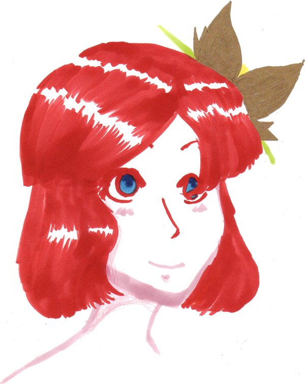
A sort of opposite picture to my prior one.
Copics and prismas yet again, and Pilot gold marker for the flower petals.
Copics and prismas yet again, and Pilot gold marker for the flower petals.
General Info
General Info
Ratings
Category Miscellaneous » Characters » Female » Young Adult (19-29)
Date Submitted
Views 1244
Favorites... 0
Vote Score 2
Category Miscellaneous » Characters » Female » Young Adult (19-29)
Date Submitted
Views 1244
Favorites... 0
Vote Score 2
Comments
3
Media Ink or markers
Time Taken 30 minutes
Reference none
Media Ink or markers
Time Taken 30 minutes
Reference none
Comments
You are not authorized to comment here. Your must be registered and logged in to comment
StonerPenguin on January 8, 2009, 1:28:10 AM
 I like puffy short hair like that, it's cuuuuttttee :D You shaded her hair well too, nice highlights. The gold flower is a nice touch. The red outline for her eyes was a god choice, makes her eyes stand out more because of the contrast with the blue of her eyes, very pretty :D
RazeTora on January 8, 2009, 4:47:56 AM
RazeTora on
Thanks :D I was trying to work well with my markers on this.Takahashi2Oki on January 1, 2009, 10:06:10 AM
 I love the colouring you used, especially in the eyes.