Ingram: shadow of the griffin
Ingram: shadow of the griffin
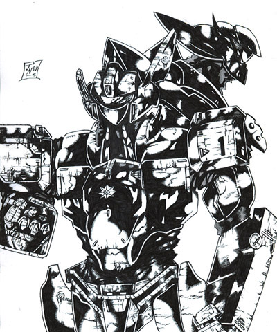
Ingram: shadow of the griffin by Rodimus84
Description
Description

I've been hooked on the patlabor series recently. I mean.... I've seen it before but I've just now been able to afford the rest of the tv series and ova. They don't do anime like that anymore. It kind of reminded me of why I dig mechs so much. This is the alphonse ingram and to the top right is the head of the griffin labor. The griffin has wings but I didn't want to complicate this pic more than it already has been. There is supposed to be some text on the ingram's arm but I couldn't find a clear enough pic.I tried not to make the griffin blend in w/ the ingram but I failed. The griffin is kind of the ingram's rival mech in the series so I sort of included it. I had so much free space I needed to put something there. I kind of know why I dig detailing so much. It just gives the mech or character a historical feel to it. Someone or something that isn't an easy icon to forget. I dunno..... it's just me digging to deep I guess.
General Info
General Info
Ratings
Category Anime/Manga » - Other series not listed
Date Submitted
Views 1672
Favorites... 2
Vote Score 0
Category Anime/Manga » - Other series not listed
Date Submitted
Views 1672
Favorites... 2
Vote Score 0
Comments
4
Media Ink or markers
Time Taken 5 hours
Reference
Media Ink or markers
Time Taken 5 hours
Reference
Comments
You are not authorized to comment here. Your must be registered and logged in to comment
luckylace222 on January 3, 2013, 1:54:51 PM
luckylace222 on
 That...is some serious ink detail!!! WOW!!!!!!!!!!!!!!!!!!!!! Just 5 hours.....WHAT THE BALLS - Did you use an ink well or anything, or was this pure pen (painstaking pen strokes one after another)? This is strong penmanship!
ToadslyQuinne on June 17, 2007, 6:23:26 PM
 Very well done! It's art like this that makes me want to see or know more about the fandoms you draw. I can differentiate between the Griffin and Ingram- it's okay. ^___^
 What I really love about your mechs is that they almost look like they're made of stone; the detail you put on the metal, the stress/wear lines and the metallic sheen, is just supurb. [*thumbs up*]
herio907 on June 16, 2007, 8:53:53 PM
herio907 on
 Very nice. It looks very nice.
Trinity_Fire on June 16, 2007, 1:53:58 PM
Trinity_Fire on
 Oh, god. Yes more amazing ink work... *O*
 Oooh, c'mon now, don't you have a slightly higher resolution? Your artwork is just mind-blowing, the way you can detail so much with ink...
So cool. It looks fine to me. :)