Nanashi
Nanashi
Nanashi by SmilinJuanValdez
Description
Description

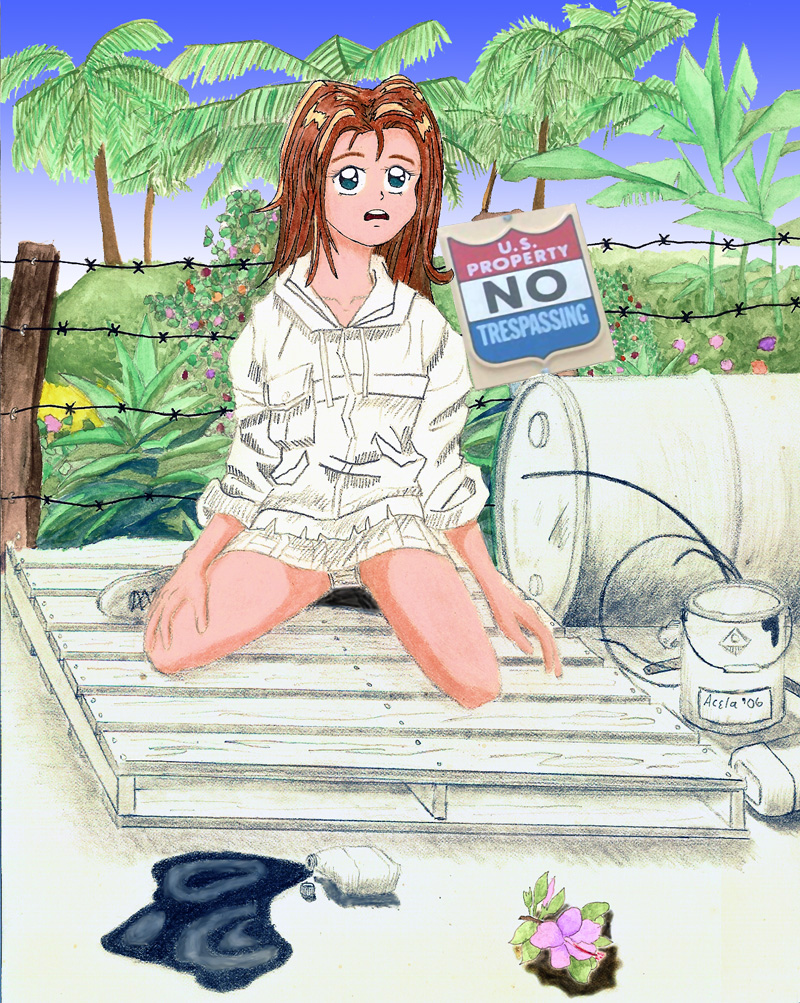
This is Nanashi, a recently introduced character from Ninja High School. Her name means No Name (or so the comic says). As far as what she''s doing in this setting, well... I have no explanation. It came to me in segments. I was originally going to have only everything behind the barbed wire in colour, with the exception of the no trespassing sign, but in a conversation with a friend we decided that the organic elements (living things) would be in colour, but then we argue that things like fence posts aren''t organic, cotton-based clothing is, etc... so behind the barbed wire got colour, in front would be black and white unless it was organic. That still doesn''t explain the sign being in colour.
General Info
General Info
Ratings
Category Comics » - Other Comic not listed
Date Submitted
Views 1472
Favorites... 1
Vote Score 0
Category Comics » - Other Comic not listed
Date Submitted
Views 1472
Favorites... 1
Vote Score 0
Comments
5
Media Colored Pencil / Crayon
Time Taken
Reference
Media Colored Pencil / Crayon
Time Taken
Reference
Comments
You are not authorized to comment here. Your must be registered and logged in to comment
fullnarutoZ on July 31, 2007, 3:09:31 PM
fullnarutoZ on
 the hair is great!
calahna on March 1, 2007, 2:40:20 PM
calahna on
 i like the concept for this picture. very nice bg, but my biggest problem with this one is the perspective. she seems to be level but the world is sliding.
as for anatomy her head is not on her neck right and her left thigh is too small.
other than these it's very nice.
SmilinJuanValdez on March 5, 2007, 8:29:44 AM
Yeah I'm pretty disapoionted in this one myself - Nanashi herself was drawn very sloppy and theres no real excuse for that. I think I tried to make up for it with the background though. I was really quite pleased with it, in spite of its simplicity. The sign I'm angry about. I did draw the actual sign, but my friend who was helping out with photoshop decided it would be easier to slap on a photo of the sign rather than to colour it. It looks too real. Perspective - I didn't go in with a plan. Garbage in - garbage out. At one point the objective became to fill in blank space on the page rather than pay attention to details. This pic is alot of lipstick on a pig.MasterTengu on December 10, 2006, 3:10:10 AM
MasterTengu on
 very nice, i like the shading on it. love the coloring too.
shoujoneko on December 9, 2006, 4:06:59 PM
shoujoneko on
 You have good ideas! I love the thought and drawing ability you've deminstrated in this pic!