Ino-chan
Ino-chan
Ino-chan by rlkitten
Description
Description

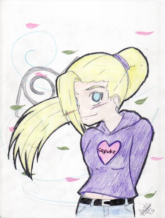
I drew this at my grandmother's house, but due to the fact that just about EVERYONE was looking over my shoulder, I couldn't concentrate at all- so the outcome was....well....bad ;_;
Well, it's just sort of like a modern-day ino, i guess. Comments and critique please! (I know there are a lotta problems with it!!!! :_;)
Well, it's just sort of like a modern-day ino, i guess. Comments and critique please! (I know there are a lotta problems with it!!!! :_;)
General Info
General Info
Ratings
Category Anime/Manga » Naruto series » Characters & Fanart » Ino
Date Submitted
Views 1428
Favorites... 4
Vote Score 1
Category Anime/Manga » Naruto series » Characters & Fanart » Ino
Date Submitted
Views 1428
Favorites... 4
Vote Score 1
Comments
6
Media Colored Pencil / Crayon
Time Taken
Reference
Media Colored Pencil / Crayon
Time Taken
Reference
Comments
You are not authorized to comment here. Your must be registered and logged in to comment
McNealy on February 23, 2008, 11:40:03 AM
McNealy on
rlkitten on February 23, 2008, 12:04:47 PM
rlkitten on
Thank you!! /\_/\ I'm glad you like it!!Trinity_Fire on November 28, 2007, 9:29:24 AM
Trinity_Fire on
 Aww, this is real cute. I like the bold outline and the soft coloring.
 Okay, let's hit this, huh? If I ever over-crit, or you don't wanna hear it, feel free to smack me a few times. I tend to go over the board or over-elaborate, so remember, this is a crit that you in no way need to take completely; pick and choose what you will of what I say, okay? Sorry; but I know lots of artists around FAC have egos they don't like pricked; I just don't want to upset anyone. :)
First off, you did the basic lines in... pencil, right? I don't have much to say for the lineart; it's pretty clean and neat, and I like it. Putting a character into more modern-day clothes was also a real nice touch.
Now, pencil is light and soft for shading, but what's really best is an inking pen, as you probably know. They're somewhat on the expensive side, but hey, it's worth it, isn't it? I personally use Micron pens; they have really fine tips, which I like, and go for... somewhere between $4 to $6 dollars a piece. I think that's no biggie. The thing with inking is that it takes a while to get used to it; and to be honest, the only tip here is practice. Ink old pieces you don't like any more; trace lines and swirls just to get used to the feel of your pen. It's permanant, but it's cleaner and better than pencil.
Your art turned out pretty nicely actually, with the pencil, but if you want to really make your picture stand out, you need to shade and not be afraid to press harder, all right? Your coloring is solid, but really kind of light and soft. Because of this, you can see the streaks and lines you made; this isn't completely un-wanted in art, as texture does matter, but when you colored Ino's shirt like you did here, it makes the picture really flat and bland. Also, a good suggestion with coloring is to follow the "lines" that the colors would take; for example, follow the hair as if you were drawing the individual strands! Of course, you're not actually drawing each strand; you're just coloring with the flow, and this appears much more natural than randomly picking a diagonal line and going at it.
For the shirt, try cross-hatching to smooth over the shading and give it a more uniform look, as that's what clothing tends to look like. By cross-hatching, I don't mean the general way of cross-hatching, but more of... doing the first 'layer' of shading as you've done now, then perhaps picking another angle to go at, and going over the shirt with another layer of color from a different direction. Also, I like to use white colored pencil to smoothen out colors; other lighter colors also often work great for this. (For example, to smoothen out red hair, I use yellow.)
A quick tip for the lineart; just those little details people tend to forget, but if Ino's ponytail is being blown by the wind, why aren't her bangs also blowing to the side? Just a quick thing to remember; otherwise, her bangs look unusually stiff. Also, your lineart's real clean, but if her eye is blocked by her hair (you're not using the anime-transparency thing, which is good; I prefer this) but then, why is her blush showing through? The blush looks kind of out of place, since it looks like it's over her hair.
Now, a little more on coloring... don't be afraid to mix and match your colors, and to press deep! It takes time and experience (and courage, in my opinion) but it's how you separate art like this, which is somewhat flattish, to art like, say, Seifer-sama? Everyone remember her? Yeah, anyway... (or just a nearly-abusive use of highlights, whatever you prefer...)
An important concept of colors is that it's not just one shade. I know they do it in anime, but really, if you want to be a good artist, don't look to anime for it. Colors are always more than just one shade, so don't be afraid to try out new colors. On this subject, some shadows would also be really nice (used in anime, even) and would really help your picture "pop" out some.
Try not to "shade" a portion of a picture with the same color for the base. For example, for her hair, instead of pressing really hard with the yellow, you could use a light brown. If it's too dark, just overlay it with white or more yellow. And if it's still too dark, heck, just erase it! Colored pencils ARE erasable, so don't be afraid to try out dark colors! Even black will pretty much mostly erase.
Also, for her purple shirt, don't be afraid of blending the purple with another shade of purple, or maybe a close shade of blue. For skin tones, I tend to add some goldenrod (yellowish) or light brown to really accent it; peach is, really, NOT the color of peoples' skin; skin is always a hard color to pin down, so don't be afraid to blend lots of colors together; it helps give your characters a more natural and, at the same time, unique feeling.
Anyway, your art is nice. Besides the roughs there, a few more basics would be... well, it's nice to be able to free-draw your own poses and everything. That's really nice. Once you're comfortable with your style and drawing, though, don't be afraid to try out some new stuff. Perspective, more active poses, stuff like that. Art is all about learning how to draw what's around you and what's in your head, and to have fun the whole while.
Good luck! :)
rlkitten on November 28, 2007, 10:08:58 AM
rlkitten on
Ah~ I got so excited by just looking at the length! This is what online art websites are for, no? (Er- that's what I think anyway)But, thank you so much! Some of the problems you pointed out I'd noticed, but I'm glad I now know how to fix them. I was also a little nervous while drawing this pic- geez i hate it when people look over my shoulders, i really can't concentrate D= - But yeah, about the pressing hard deal: I always pressed to hard while doing sketches with just a regular pencil, so I tried to lighten it up- but along with it came my coloring (somehow) I'm trying to fix it though (also the issue with everybody watching me) but I still could have gone back to it after everyone had left, so that's partially my fault~
Lol, good point with the bangs and wind, it didn't come out exaclty as hoped, but here's how I "kinda" saw it:
The wind was sort of going to the side and towards her back a little more...if that makes sense ^_^' So I just figured that her hair would be blown around her face a little more (if that makes sense either)
Anyway, really good points! Thank you so much!!!! <3
Sharidaken_Tranqity on November 27, 2007, 8:37:22 AM
 Cute...
rlkitten on November 27, 2007, 8:38:53 AM
rlkitten on
thanks /\_/\
besides, this is very well done. I know I could never do that with anyone looking over my shoulder! You are very talented.
^_^