dragon,king of beast
dragon,king of beast
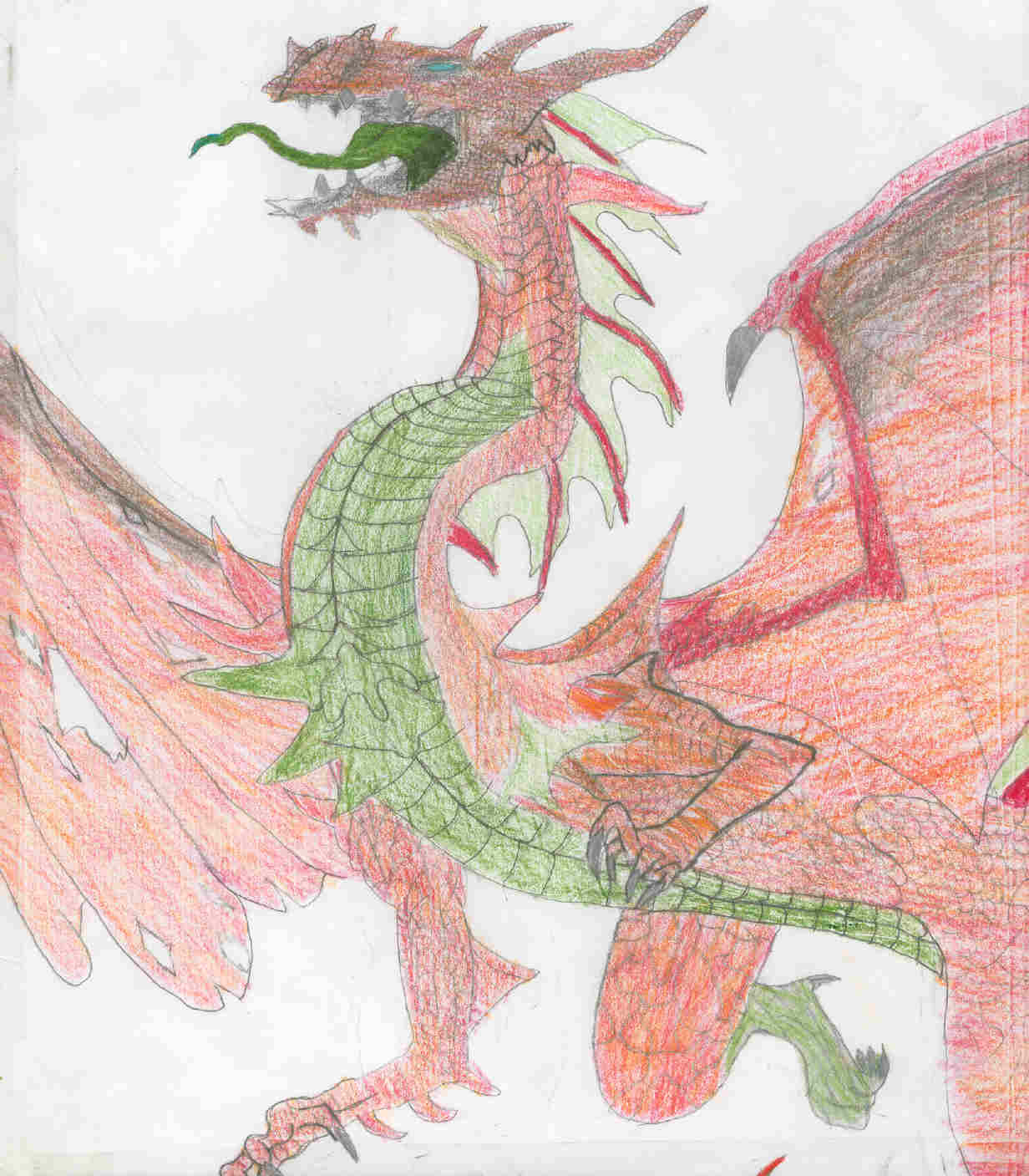
dragon,king of beast by Yu-Gi-Oh_Fan_number1
Description
Description
This is the best picture i ever made.
General Info
General Info
Comments
4
Media Unspecified
Time Taken
Reference
Media Unspecified
Time Taken
Reference
Comments
You are not authorized to comment here. Your must be registered and logged in to comment
Queen_Asheer5600 on January 8, 2005, 1:10:58 AM
Stratadrake on December 28, 2004, 5:22:38 AM
Stratadrake on
 The picture is not "copied" as in stolen... yes, the resemblance to the other dragon is pretty uncanny, but there are a lot of differences between them. I'm not just talking about that this one is colored and the other one is not, look closely and you'll spot differences in the actual composition:
- Torso scales are a different (IMO better) pattern
- Head scales are also different
- Forelimbs are different
- Tail ends in different places
- Chest designs are different (notice the green spikes)
- Tongue is different
- Teeth are different
- Crest horns are thinner/longer
- Eye is larger
I believe that both this and the other picture were based on the same (other) reference picture, namely a large poster of a dragon. Either that or a book cover; I'm darn sure I've seen this pose used before in a commercial context, but I can't say exactly where.
Moon_Bind on December 28, 2004, 1:26:31 AM
Moon_Bind on
 this was copied and recolored from: http://www.fanart-central.net/pictures.php?op=picture&picture=108942
Even the shedding was copied!
Stratadrake on December 10, 2004, 3:37:28 AM
Stratadrake on
You mean, the best pic you've ever made SO FAR. That pose looks very familiar, you used a reference, yes? I just know I've seen that pose before.Anyway, that means I can't do much critiquing on the dragon's physiology (wings are a good size, if a bit thin, tongue appears a bit long, yada yada yada...). But I wouldn't feel right leaving a comment without first giving a suggestion, so I'll drop one on technique.
I've done a lot of colored pencil myself, and I learned awhile back that colored pencil on pencil doesn't always mix well. Take the head for example. It looks a little "dirty" because of coloring directly over the pencil, causing the pencil marks to smudge and smear and make it appear grayish. A tip for you, is when you color in a pencil sketch, ERASE the pencil lines/shading from an area immediately before coloring that area in with colored pencil. Colorwise, you'll get MUCH bolder results this way. It also helps that when you're going to color a drawing in, don't do any shading with the pencil beforehand, just lineart.
The dragon's scales are pretty fair. Not perfect, but far from bad. Textures like these are one area that can really benefit from erasing the pencil before laying down the color. It looks as if you used a mixture of red and orange hues for the dragon's body, if you overlay, say, a darker red scale-pattern on it, you can get scales that are easier to notice.
So, all in all he's not bad, he just suffers from a technique issue here or there.
Indeed this image is based off of a poster, which indeed I have, I really loved the way you did this image, it looks wonderful and it's greatly done. Great job :)