Gene Kelly
Gene Kelly
Gene Kelly by BAMFManiac
Description
Description

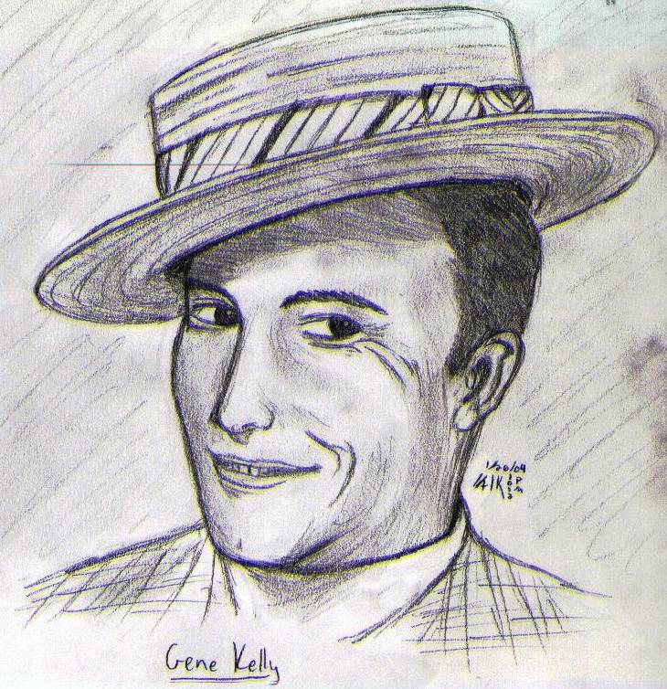
ok, i know most of you don't know who this is, but gene kelly was one of the most amazing dancers who ever lived, and he starred in several popular musicals between the 40s-60s, including Singin' in the Rain, An American in Paris, Anchors Aweigh, and On the Town. he is one of my favourite actors. <br />
<BR>i messed up on this, but it's the best realistic pics i've done so far. i submitted it to my skool's literary magazine. Please Comment!
<BR>i messed up on this, but it's the best realistic pics i've done so far. i submitted it to my skool's literary magazine. Please Comment!
General Info
General Info
Ratings
Category Real People » Actors/Actresses
Date Submitted
Views 2207
Favorites... 1
Vote Score 1
Category Real People » Actors/Actresses
Date Submitted
Views 2207
Favorites... 1
Vote Score 1
Comments
18
Media Unspecified
Time Taken
Reference
Media Unspecified
Time Taken
Reference
Comments
You are not authorized to comment here. Your must be registered and logged in to comment
BAMFManiac on May 24, 2004, 11:06:58 AM
BAMFManiac on
ahh hurray a singin' in the rain fan! you are cool! and thank you so much!Mechpencil on May 23, 2004, 11:37:48 AM
Mechpencil on
Jyan on April 6, 2004, 1:42:46 PM
Jyan on
BAMFManiac on March 15, 2004, 3:48:35 PM
BAMFManiac on
thank you very much!!!<br /><br />
lol yea i know about the eyes- in the sketch, there is a bit of a glint in his eyes, but it didn't scan well. and i tried to give them some life by having different degrees of colour to separate the pupils and iris (the reference was black and white, so i just made it up), but i messed it up and then just ended up shading it all in. heh heh lazy... but thanks again!!
Raymei on March 13, 2004, 6:29:31 PM
Raymei on
 wow, Alex, that's awesome!!! n.n <br />
(no way am i reading all of that, I'm way too slow a reader... T.T;;; )<br />
<br />
I love it n.n it's especially hard to have to switch between realism and cartoons so I commend you for that above all.<br />
The lining and shading is great!<br />
I have to say that my only real beef with the picture is that the eyes seem somewhat lifeless (although I'll say right now that it's extremely difficult to capture the life and beauty of actual human eyes) n.n<br />
<br />
great job!!
BAMFManiac on January 28, 2004, 3:50:34 AM
BAMFManiac on
wow thanks! yea this is one of the only pics i've ever done that i'm actually kinda proud of (especially out of my realistic ones b/c i can't draw realism). <br /><br />
i know the hat came out all weird, and yes this was taken from an old picture in black and white, so the eyes were mostly black. i tried to make it seem like there was a pupil, but eventually i just coloured it all black and left the little glint thing. <br />
<br />
and thanks, i hope the literary magazing thing goes well too!
Jyan on January 27, 2004, 6:45:18 PM
Jyan on
<br />
I can tell the iruses aren't just solid black with a reflection in it, but you probably should be able to see a little more detail in it. I konw this was probably taken from possibly an old photo, or something in black and white, or something that would not allow you to see small details like that, (Or maybe you did put more detail in and the scanner just didn't pick it up?) but I think it would help if you put in the lines that go in an outward burst from the center of the pupil.<br />
<br />
Over all you did a great job (You always do =D)! It took me a while to find things you could improve on and even then I couldn't only find small details that there would have been no chance of me finding them if I wasn't actually looking. But art is in the details. It is those details that make the viewers go "Wow...".<br />
<br />
I hope this literary magazine thing went well!
Jyan on January 27, 2004, 6:45:03 PM
Jyan on
<br />
Teeth are hard to make look normal. When I drew my GF the teeth just drove me crazy! I eventually realized that the lines deviding them were very faint in the picture and I was drawing them too darkly (even though I wasn't drawing that dark). So I made them lighter and eventually they looked like normal (The too dark of lines made it appear as if there are gaps between the teeth and also it draws the attention to them, even if there are darker things around). But the teth in this pic were done pretty well, I wouldn't have commented on them if I hadn't had troubles with teeth in my past.<br />
<br />
It is hard to draw a face at an angle because the side of the face has to appear to go back so it doesn't look like it goes on the front of the face lol =) You did it pretty well in this pic but I think the shadows on the cheek might (Maybe... I'm not sure) benefit from being darker (emphasizing the distance it goes). The shadows on the cheek in front should still be lighter than the ones in the back but I suggest you darken them as well (not that much darker though).