Glass of wine
Glass of wine
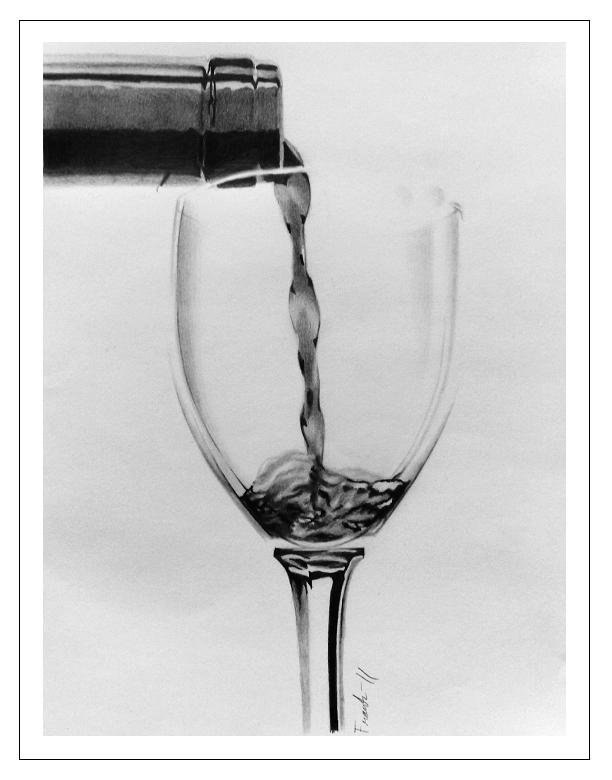
Glass of wine by Frankyboy
Description
Description

Saw a similar drawing and wanted to try it myself.
Drawn with H4, B, 2B and 4B Derwent graphite pencils on A4 paper
Edit: Thank you for my second feature! Didn´t think this would be that popular.
Also thank you strawberry for suggesting it <3
Drawn with H4, B, 2B and 4B Derwent graphite pencils on A4 paper
Edit: Thank you for my second feature! Didn´t think this would be that popular.
Also thank you strawberry for suggesting it <3
General Info
General Info
Ratings
Category Miscellaneous » Objects » Food and Drink
Date Submitted
Views 4126
Favorites... 38
Vote Score 29
Category Miscellaneous » Objects » Food and Drink
Date Submitted
Views 4126
Favorites... 38
Vote Score 29
Comments
51
Media Graphite pencil
Time Taken 7 hours
Reference Photo
Media Graphite pencil
Time Taken 7 hours
Reference Photo
Comments
You are not authorized to comment here. Your must be registered and logged in to comment
moonstone9 on May 26, 2011, 8:36:43 AM
moonstone9 on
Frankyboy on May 26, 2011, 8:38:37 AM
Frankyboy on
Yes, yes I didmoonstone9 on May 26, 2011, 8:54:54 AM
moonstone9 on
Frankyboy on May 26, 2011, 8:56:18 AM
Frankyboy on
Thank you =Pmoonstone9 on May 26, 2011, 11:35:15 AM
moonstone9 on
kayteekinze on May 16, 2011, 8:45:50 AM
kayteekinze on
Vhee_2 on April 8, 2011, 7:40:24 AM
Vhee_2 on
 HEll yeah great job!
BlueCuckoo on April 2, 2011, 9:29:24 PM
BlueCuckoo on
 I keep waiting for the water/wine to pour out but it never does... D=
Enkeli on March 21, 2011, 10:56:49 AM
Enkeli on
 I must say that this is an extremely well drawn piece.
Though the only thing that is bothering me is the bottom of the glass. It looks... awkward. It looks to me that it is just floating there, the bottom where the liquid is.
The depth perception seems a tad bit skewed on the glass too, like it seems that the glass warps as you look down form the top to the bottom, I'd say that a tad bit more shading with a lighter pencil would fix that right up, and as for the floating bottom, the same thing would help.
As far as the composition goes, I'd recommned avoiding the middile of the page for your concentration, it seems a bit cliched and a bit overly pretentious when you center a piece, plus, if it is less centered you'll have a greater value change between areas.
The piece is very well done over all. I commend you on a good job, and I hope to see more great pictures form you.
(I sincerely apologize if I was out of lne in my critique, I am merely here to provide more feedback than the ever so cliched "good job" "epic" "amazing" etc)
Frankyboy on March 27, 2011, 9:57:12 PM
Frankyboy on
First and foremost, thank you for giving a comment with more meaning than the regular "Awesome" or "Great work", don´t get a lot of those.Now, I know the bottom of the glass looks a little off, but it actually looked like that in the ref-pic I used for the drawing. I suppose I could add some shading or whatever to that part, but I wanted to follow the photo to every detail as much as I could while drawing, so...
I agree however that I could add some lighter shading in some parts, though.
As for the composition, I actually tried drawing the glass more to the right side of the paper when I first started, but to me, it looked very off and wrong. That´s why I chose to draw the glass in the middle of the paper. Clichéd, perhaps, but there´s also a reason why drawings like these, for the most part, have the object centered in the middle of the paper, it looks best that way. But, of course, that´s only MY opinion, and like with everything else, people have different opinions, and I just like the way the drawings like this look when the main object is in the center of the pic. You may not agree, that´s your opinion, not trying to be disrespectful or anything, you have every right to it, and I respect that.
Thanks again for liking my work, hope to hear more from you regarding my art in the future.
Yoshi4EverAfter on March 17, 2011, 6:14:24 AM
 When I first saw it, I thought it was a photo! Great job, man!
RalomMaramures on February 28, 2011, 1:26:10 PM
 super!!!
Mist_Wing on February 27, 2011, 5:33:12 AM
Mist_Wing on
 oh wow!
awesome drawing, in the thumb nail i thought it was a black and white photo, shows you how talented you are! once again great work
tzutosmila on February 26, 2011, 6:23:12 AM
tzutosmila on
 Awesome!!!
PeachyDreamy on February 16, 2011, 1:59:53 AM
PeachyDreamy on
 Wow! Very nice! :)
????????????