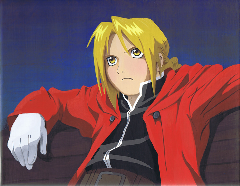
Edward Elric on Bench
Edward Elric on Bench
Edward Elric on Bench by ablevins
Description
Description

Another stab at color using acrylics to do Edward Elric sitting on a bench. Let me know what you think!
General Info
General Info
Ratings
Category Anime/Manga » Fullmetal Alchemist » - The Elrics » Edward
Date Submitted
Views 2466
Favorites... 16
Vote Score 9
Category Anime/Manga » Fullmetal Alchemist » - The Elrics » Edward
Date Submitted
Views 2466
Favorites... 16
Vote Score 9
Comments
13
Media Acrylics
Time Taken
Reference Pic from a magazine
Media Acrylics
Time Taken
Reference Pic from a magazine
Comments
You are not authorized to comment here. Your must be registered and logged in to comment
Baronsgirl on April 15, 2010, 4:41:01 AM
Baronsgirl on
 Wow nice use of color... He looks especially hot in this picture. I LOVE EDWARD ELRIC... you should to.
MomoRyu on February 26, 2010, 2:54:01 AM
MomoRyu on
 TOTALLY AWESOME! This looks just like an animation cel! You're amazing! *faves*
luckylace222 on September 7, 2009, 10:16:06 AM
luckylace222 on
 8D Acrylic looks really good with anime. 8D
Devon11 on April 21, 2009, 10:57:30 AM
Devon11 on
 OMG THIS IS SO AMAZING!
chewymonstahh027 on April 17, 2009, 9:10:48 PM
 the face is a little... big. BUT SO AWESOME I CANT MAKE SOMETHING LIKE THAT IM SO BAD AT COLORING!
SweetxinsanityxSarah on April 17, 2009, 11:03:25 AM
 Murph! Loveness x3 -favness!- woops broke the fav button again xD
WannabeArtist on February 17, 2009, 2:26:01 AM
 this is great! the strokes are so fine it looks almost as if it was computermade.. :D
Asj on February 12, 2009, 11:56:39 AM
Asj on
 The colors look off somehow, perhaps a little too bright or saturated (or unsaturated? I get that mixed up...), and his face doesn't seem quite right - probably from a lack of outlines, but it looks really good. ^_^
It's so hard using paint! One of the first times I tried painting something, I realized how hard it is to get the correct colors, and even recently, years later, it's hard to get the lines right, since brushes tend to want to mess up everything.
ablevins on February 13, 2009, 8:31:05 AM
ablevins on
Thanks for constructive criticism. The color saturation was intentional. I didn't want it to look muted or pasty. In the background I was going for an atmospheric haze that I obviously did not accomplish! You are right about the face. In most of my other drawings and paintings I have tried to keep the proportion correct but instead of using thick black outlines I tried to add depth by using shading. As you pointed out, painting is a whole different animal than drawing which I think I do a better job at. Thanks again and good luck with your work! You have an impressive gallery on DeviantArt!!!!BadArtist on November 24, 2008, 11:36:20 PM
BadArtist on
 I think I'm gonna favorite this... maybe.
kaitlin_mckitrick on November 24, 2008, 4:17:38 AM
 Great! Amazing job! It looks just like him! FAVS~