Username   Password  
Remember   Register   |   Forgot your password?

A boy

A boy

A boy by punkaddict
A boy by punkaddict

Description

Description
punkaddict
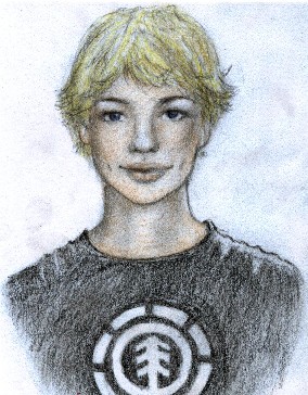
This is a quick scetch of a boy I saw on the street one day..I thought he was so cute..So I had to put him down on the paper..what do you think..? Please be nice.. =)

General Info

General Info
Ratings
None

Category Real People
Date Submitted
Views 5636
Favorites... 17
Vote Score 0
Comments 41
Media Unspecified
Time Taken
Reference
Tags

Comments

Comments (41)

You are not authorized to comment here. Your must be registered and logged in to comment

JamesJrz_Tribe on June 11, 2005, 1:38:51 AM

JamesJrz_Tribe on
JamesJrz_TribeIt seems like you have a good handle on the software you are using, I'm still trying to render things like this (I stink at photo-realism)^^; While it is off to a good start there are some issues with the picture that could be fixed very easily if you are willing to go back and work on it. ***Constructive crit ahead*** First, The whole picture should have darker dark areas and lighter light areas. This will help the bone structure (which you have already lightly defined) pop more and make it more dimensional. Some areas that need to be "pushed in" with darker tones the most are the eye sockets, under the lips, and the creases alongside of their noses. I would re-work their eyes a lot, they are very cartoony for such a realistic piece and seem a little crooked (more on the little boys face). This may be just me, but their hairlines look very high as well....
Overall on this picture (or the next one you try) you should consider "tightening it up" by defining areas with sharper lines.....not SOLID lines, but just a little bolder and darker.
If this is not an overlay over a photo, I think you have a good skill at realism ^__^ you just need to tweak it some more and you could be a pro eventually~ nvm check mine out 2!!!!!!!!!!!!!!!!!!!!!!!!!!!!!!!!!!!!!!!!!!!!!!!!!!!!!!!!!!!!!!!!!!!!!!!!!!!!!!!!!!!!!!!!!!!!!!!!!!!!!!!!!!!!!!!!!!!!!!!!!!!!!!!!!!!!!!!!!!!!!!!!!!!!!!!!!!!!!!!!!!!!!!!!!!!!!!!!!!!!!!!!!!!!!!!

JamesJrz_Tribe on June 11, 2005, 1:38:50 AM

JamesJrz_Tribe on
JamesJrz_TribeIt seems like you have a good handle on the software you are using, I'm still trying to render things like this (I stink at photo-realism)^^; While it is off to a good start there are some issues with the picture that could be fixed very easily if you are willing to go back and work on it. ***Constructive crit ahead*** First, The whole picture should have darker dark areas and lighter light areas. This will help the bone structure (which you have already lightly defined) pop more and make it more dimensional. Some areas that need to be "pushed in" with darker tones the most are the eye sockets, under the lips, and the creases alongside of their noses. I would re-work their eyes a lot, they are very cartoony for such a realistic piece and seem a little crooked (more on the little boys face). This may be just me, but their hairlines look very high as well....
Overall on this picture (or the next one you try) you should consider "tightening it up" by defining areas with sharper lines.....not SOLID lines, but just a little bolder and darker.
If this is not an overlay over a photo, I think you have a good skill at realism ^__^ you just need to tweak it some more and you could be a pro eventually~ nvm check mine out 2!!!!!!!!!!!!!!!!!!!!!!!!!!!!!!!!!!!!!!!!!!!!!!!!!!!!!!!!!!!!!!!!!!!!!!!!!!!!!!!!!!!!!!!!!!!!!!!!!!!!!!!!!!!!!!!!!!!!!!!!!!!!!!!!!!!!!!!!!!!!!!!!!!!!!!!!!!!!!!!!!!!!!!!!!!!!!!!!!!!!!!!!!!!!!!!

JamesJrz_Tribe on June 11, 2005, 1:38:49 AM

JamesJrz_Tribe on
JamesJrz_TribeIt seems like you have a good handle on the software you are using, I'm still trying to render things like this (I stink at photo-realism)^^; While it is off to a good start there are some issues with the picture that could be fixed very easily if you are willing to go back and work on it. ***Constructive crit ahead*** First, The whole picture should have darker dark areas and lighter light areas. This will help the bone structure (which you have already lightly defined) pop more and make it more dimensional. Some areas that need to be "pushed in" with darker tones the most are the eye sockets, under the lips, and the creases alongside of their noses. I would re-work their eyes a lot, they are very cartoony for such a realistic piece and seem a little crooked (more on the little boys face). This may be just me, but their hairlines look very high as well....
Overall on this picture (or the next one you try) you should consider "tightening it up" by defining areas with sharper lines.....not SOLID lines, but just a little bolder and darker.
If this is not an overlay over a photo, I think you have a good skill at realism ^__^ you just need to tweak it some more and you could be a pro eventually~ nvm check mine out 2!!!!!!!!!!!!!!!!!!!!!!!!!!!!!!!!!!!!!!!!!!!!!!!!!!!!!!!!!!!!!!!!!!!!!!!!!!!!!!!!!!!!!!!!!!!!!!!!!!!!!!!!!!!!!!!!!!!!!!!!!!!!!!!!!!!!!!!!!!!!!!!!!!!!!!!!!!!!!!!!!!!!!!!!!!!!!!!!!!!!!!!!!!!!!!!

JamesJrz_Tribe on June 11, 2005, 1:38:48 AM

JamesJrz_Tribe on
JamesJrz_TribeIt seems like you have a good handle on the software you are using, I'm still trying to render things like this (I stink at photo-realism)^^; While it is off to a good start there are some issues with the picture that could be fixed very easily if you are willing to go back and work on it. ***Constructive crit ahead*** First, The whole picture should have darker dark areas and lighter light areas. This will help the bone structure (which you have already lightly defined) pop more and make it more dimensional. Some areas that need to be "pushed in" with darker tones the most are the eye sockets, under the lips, and the creases alongside of their noses. I would re-work their eyes a lot, they are very cartoony for such a realistic piece and seem a little crooked (more on the little boys face). This may be just me, but their hairlines look very high as well....
Overall on this picture (or the next one you try) you should consider "tightening it up" by defining areas with sharper lines.....not SOLID lines, but just a little bolder and darker.
If this is not an overlay over a photo, I think you have a good skill at realism ^__^ you just need to tweak it some more and you could be a pro eventually~ nvm check mine out 2!!!!!!!!!!!!!!!!!!!!!!!!!!!!!!!!!!!!!!!!!!!!!!!!!!!!!!!!!!!!!!!!!!!!!!!!!!!!!!!!!!!!!!!!!!!!!!!!!!!!!!!!!!!!!!!!!!!!!!!!!!!!!!!!!!!!!!!!!!!!!!!!!!!!!!!!!!!!!!!!!!!!!!!!!!!!!!!!!!!!!!!!!!!!!!!

ronin on May 8, 2005, 4:11:24 PM

ronin on
roninaww adorable!

dead_artist on April 14, 2005, 12:35:18 PM

dead_artist on
dead_artistawww he looks so cute! ur real good at drawing!

musicaljerseygrl7490 on April 13, 2005, 1:47:43 PM

musicaljerseygrl7490 on
musicaljerseygrl7490wow! he looks really cute!